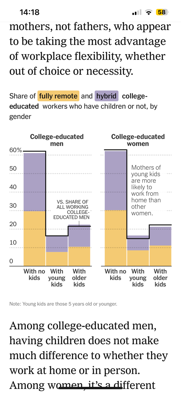
I have been looking at the article from the NYT: ‘Who Works From Home’ published March 08. In particular, I have been looking at this image (Graph is titled “Share of full remote and hybrid college-educated workers who have children or not, by gender”). My question is there are better or clearer way to show when a group is under or over represented. Also, how would you rewrite their descriptor “Mothers of young kids are more likely to work from home than other women.” I think it is misleading in the way it is presented, but not sure how I would do it better…
2 Likes
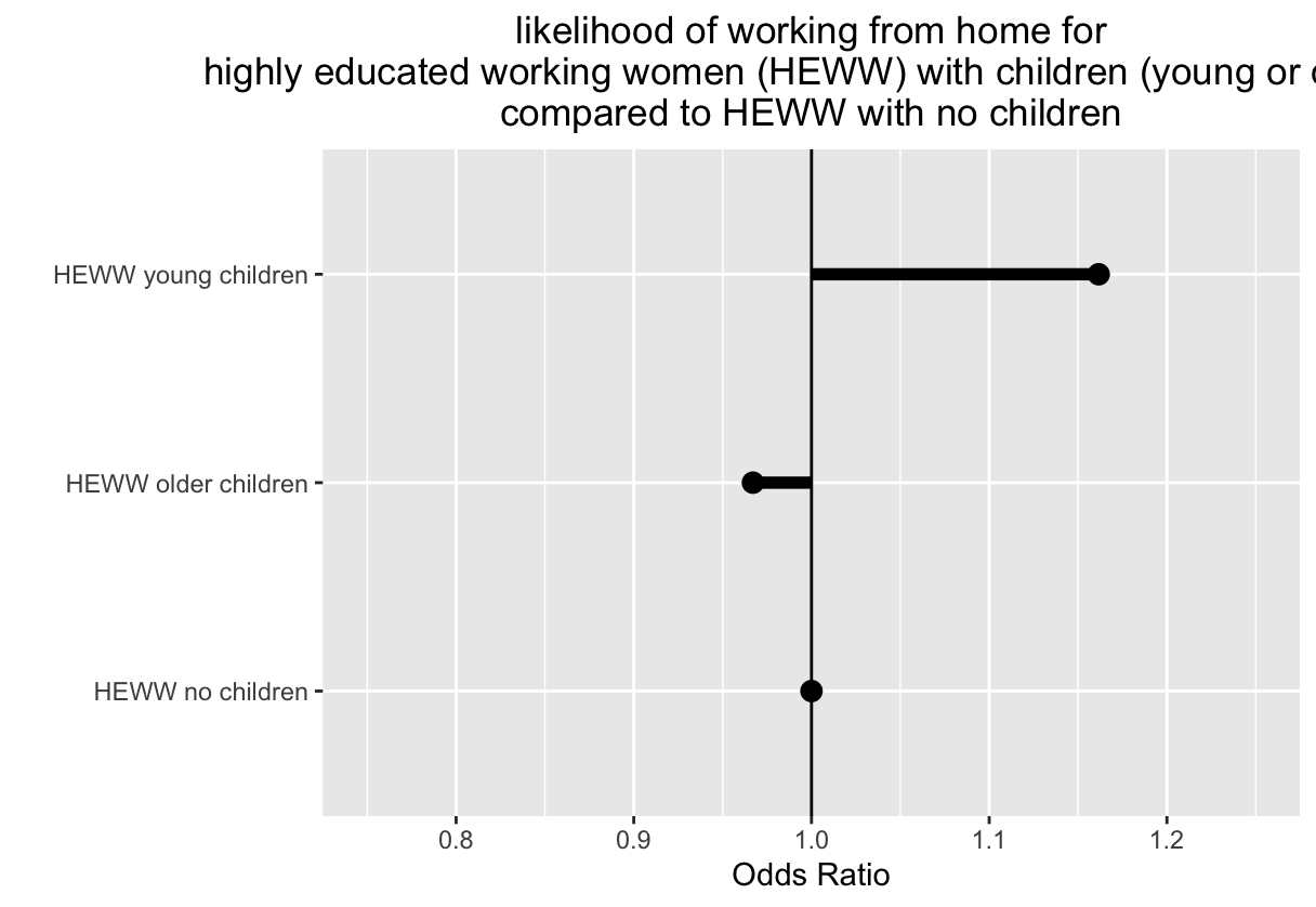
Okay, I figured it out for myself. It’s basically an odds ratio and if I think of it as a forest plot, it makes sense. I am borrowing that from my work in health economics, but I think it fits perfectly here!
I am confused by this figure. Is the “with young kids” what we should be focusing on? If I am reading it right, men and women with no kids are more likely to work remote or hybrid as compared to people with kids. Or are we not supposed to compare them? I am confused here…
We typically use representation indices to show representation and compare across groups.
1 Like
Hmm, I’m reading this in the opposite way, @sar46148, showing that people with no kids are under-represented among the remote/hybrid workforce.
It’s unclear to me if the NYT description of “Mother’s with young kids…” is meant to only describe how to read the figure, or if it’s also highlighting a key finding. I think they could have done better by pointing to the solid line and writing, for example “Mother’s with older kids make up ~23% of the overall female workforce.” And then another pointer to the top of the colored bars saying “Mother’s with older kids make up ~21% of the female remote/hybrid workforce.”
I guess we don’t know the statistical significance here, but I read this graph as mainly showing that the remote/hybrid workforce is a good reflection of the overall workforce.
(What really strikes me about this figure is the similarity between men an women in the share of the workforce that has kids.)
2 Likes
I would be interested in knowing the prevalence of working from home given the presence or absence of children. This chart doesn’t help with that.
1 Like
The point is that if you are a highly educated working women with young kids, the odds of you working from home are higher than if you are a HEWW with no kids. So you are separating out into different populations (with young kids or with no kids) and looking at the likelihood of the outcome (WFH) within that population (HEWW with young kids) compared to the likelihood of that outcome in a different population (HEWW with no kids)… Representativeness Index is a different approach with some advantages (seems easier to understand, aligns perfectly if your outcome is to understand representativeness across different populations, doesn’t require you to assume any ‘base’ population to compare to.) the Odds Ratio approach has different advantages: it lets you utilize hypothesis testing (you can estimate confidence intervals); allows you to analyze complex interactions between different variables (here, for example, the interaction between gender and presence of children on the outcome (WFH) ) ; and lets you analyze without assumptions about the underlying distribution of the populations being studied ; and even lets you analyze without knowing the total population numbers (n) - which are sometimes not well fixed. The percentage approach that the RI is based on is very sensitive to the total n numbers, so if you are not sure about those or if those prove to be unstable, the RI might be too responsive to give you a useful signal.