Does anyone have any creative ideas on how to present intersectional data?
Obviously there is the basic participant demographics table, choosing to disaggregate by 2 variables, as any more than that gets too complicated to read.
I have tried word clouds and venn diagrams, but they don’t really cut it.
All ideas gratefully received.
I think it might be helpful to start with the end - what do you want readers to take away from the data? And then build around that main message. What format is your data in?
I agree that you should first consider the research question you’re aiming to address with the data. But there are different ways in which you can visualize it. And yes looking at more than 2 identities at a time is often too much and can result in low base sizes where you might be at risk of confidentiality depending on your dataset and context.
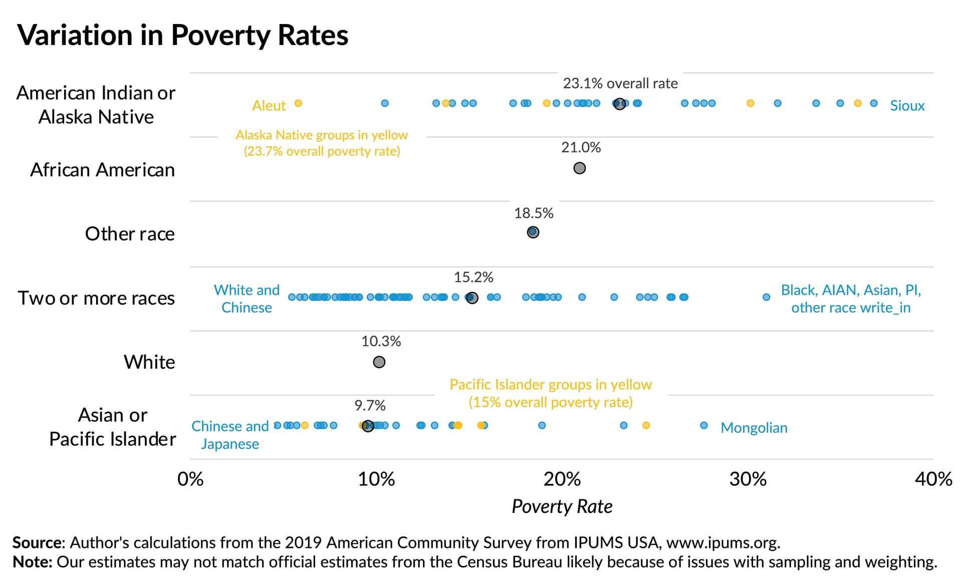
Here’s a World Economic Forum article and another from McKinsey & Company that have examples of visualizing intersectionality; in which you can do so via charts, tables, or a combination of both. Be mindful of color and other design choices you make too to avoid embedding biases in how you communicate your results. The Urban Institute has a few visualization guidelines you could leverage for this.
For example they have a pretty cool example in showing variance in experiences based on racial identities, and this could probably be recreated to have an intersectional lens too since there are 2 layers to the visualization where you see the average rate for each racial group and then a double click for racial categories that contain several identities.
Great questions and good ideas already. Here is a video that sort of addresses your question from a different direction. Mona Chalabi has a great take on thinking about the data and how to share it. In this case, I think she could help you with sharing intersectionality data by emphasizing how they are revealing critically important data because they are not necessarily tracking with the overall mean.
Thank you for replying dshipley2. Survey data. Most variables have been collapsed into binary for ease. The aim of the analysis is to find out which identities compound to reduce access/use of SRH services (who is the most left behind in accessing SRH services). Yes we also have qualitative data to understand the why, but here I am asking about quantitative data to understand the who.
Thank you Steed, love the video. Yes we purposively sampled the ‘lost birds’ as participants for the survey data. But I guess that you can get lost birds within the lost birds!
The challenge is how you present the data graphically/pictorially when you want to illustrate multiple overlapping identities (variables).
i love Stephanie Evergreen for data viz inspiration. I did a quick search and didn’t see anything particular for your data, but I’m always finding lots of ideas there. This article might be a good place to start: https://stephanieevergreen.com/4-chart-types-that-fight-for-equality/
A long article, but I like the idea of showing separate charts for each group (“rearrange”), rather than all the groups together on one chart (also helps avoid the common pitfall of comparing groups to each other rather): Stop aggregating away the signal in your data - Stack Overflow Blog